Ever wondered why one design outshines another? The secret often lies within the nuanced world of typography and spatial decisions. In this post, we’ll decode six UI design hacks that harness the power of typography, transforming the ‘unremarkable’ into a game-changing design tool. We’ll journey through mastering line height, perfecting letter spacing, and much more. By the end, you’ll possess a toolkit of UI design strategies, equipping you to navigate the design world with more confidence. Ready to embark on this transformative journey into UI design hacks?

Understanding Typography: The Foundation of Good Design
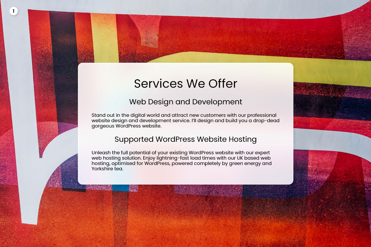
Typography, frequently underappreciated, is a critical pillar of effective design. As a budding designer, I too was once captivated by vibrant colours and dynamic animations, while typography seemed mundane. Yet, as I ventured further into the design sphere, I discovered the profound impact typography has. More than just picking an appealing font, it’s about skilfully integrating that font into your design. Think alignment, line height, and letter spacing – all geared towards achieving not just legibility but visual harmony.Let’s delve into these principles with a sample layout. As we explore these design hacks, we’ll apply them to the layout, providing a clear understanding of their impact. By the end, I promise you’ll see typography in a new light and be primed to elevate your designs using these techniques. After all, effective design isn’t magic—it’s about grasping and applying key principles. So, are you ready to master typography, the bedrock of excellent design?This is the design we’ll be improving in this post:
Hack #1: Managing Text Width
Now that we’ve dipped our toes into the sea of typography, let’s wade a little deeper and begin our journey with the first design hack – mastering text width.
Have you ever opened a book to find a wall of text staring back at you? It feels overwhelming, doesn’t it? The same principle applies to digital design. Long lines of text can intimidate your users, and if they’re not keen on tackling this textual marathon, your insightful content may go unread.
A study conducted by the Baymard Institute throws light on this issue. It suggests that users find long lines of text daunting, leading to a reduced understanding of your product or service benefits and, ultimately, lower conversion rates. It’s a bit like serving up a whole buffet in one go – it’s overwhelming and unappetising, despite the quality of the food.
To combat this, the Baymard Institute recommends keeping body text within the range of 50 to 75 characters. This range creates a line of text that is comfortably digestible, much like how a well-served meal is appetising and easy to eat. For designs meant for larger screens, such as desktops, a practical guideline is to aim for a width of around 600 pixels.


Balancing your text width is about making your designs inviting and user-friendly. It’s not about cramming in as much text as possible, but presenting your content in a way that’s appealing and easily digestible for your audience. With this tip in your designer’s toolkit, you can create designs that invite your users in, rather than pushing them away.
Hack #2: Utilizing Spacing for Better Relationships
Our final design hack revolves around one often overlooked but vital aspect: spacing. Spacing, specifically in relation to text elements, can be a powerful tool in your design arsenal. It’s like the silent conductor of an orchestra, subtly guiding the performance without making a sound.
New designers sometimes neglect spacing, treating it as merely a passive backdrop. However, much like a great musical conductor, it plays an active role, shaping the relationship between different elements on your page. Just as you carefully consider images, buttons, and animations, whitespace should be given equal importance.
Consider the relationships between different text elements on your page. Some elements are more closely related than others. For example, in a group of text elements, a subheading has a closer relationship to the paragraph below it (which it introduces) than to the paragraph above it.
A useful rule of thumb is that elements with a closer relationship should be positioned nearer to each other.
To quantify this, you can use a multiplier to determine the appropriate distance. If the distance between the subheading and the following paragraph is 16 pixels (let’s call this 1x), the distance between the subheading and the previous paragraph should be twice that – 32 pixels (or 2x). This principle applies to a variety of UI elements such as call-to-action elements, hero texts, logos and links in navigation menus, and so forth.


Properly utilising space can dramatically improve your design. It allows your elements to breathe and guides your audience through the content in a natural, intuitive manner. Remember, good design is about harmony, and spacing is a key player in creating that harmonious design symphony.
Hack #3: Mastering Line Height
You might be asking what exactly is line height? Well, in the simplest terms, it’s the space between lines of text. It’s like the air we breathe – hardly noticeable when it’s just right, but absolutely critical for comfort and clarity. In the world of design, tweaking the line height can quickly transform your layout, making it appear more professional and polished.
Think of line height as the space in a car park. Too little, and the cars (or, in our case, the lines of text) are uncomfortably squeezed together, making navigation a challenge. Too much, and the space feels desolate and disconnected. The trick is to find the perfect balance – enough room for each car, or line of text, to breathe without overwhelming the area.
To understand this better, let’s have a look at some big players in the industry. When we examine the websites of companies like Google, Dropbox, and Uber, we notice a pattern. These industry leaders generally maintain a similar range of line heights for their headings, typically around 1.2 times the size of the text. It’s interesting to note that as the heading size increases, the line height decreases proportionately. For body text, these websites tend to have a line height of about 1.4 to 1.5 times the text size.
These observations aren’t just for show and tell – they form the basis of our first key takeaway. When adjusting line height in your designs, aim for 1.1 to 1.3 times the size for headings and 1.3 to 1.5 times the size for body text.


Remember, mastering line height is a bit like fine-tuning a musical instrument. It’s about hitting the right note that brings harmony to your design. So, try experimenting with these suggested ratios, and observe the difference it makes to your designs. It’s the first step towards making your layouts not only good but exceptional.
Imagine trying to read a book where the text is centred on some pages, right-aligned on others, and left-aligned on the rest. A bit disorienting, wouldn’t you agree? That’s because our eyes, trained to follow a specific reading pattern, struggle when text alignment keeps shifting. While centre-aligned text might seem balanced, it actually poses a challenge for readability as our eyes need to work harder to find the beginning of each line. It’s like navigating through a new city without a map – a tad confusing and time-consuming.
Now, this isn’t to say that you should completely banish centre-aligned text from your design vocabulary. Like any tool, it has its time and place. Headings and shorter text segments, for instance, can benefit from being centre-aligned. It’s like presenting a beautiful dish in the middle of a plate – it naturally draws attention.
However, when it comes to longer blocks of text, left alignment is typically your best bet. This is because our eyes naturally move from left to right when reading (for languages written in this direction), so left-aligned text feels more comfortable and efficient to read.
One thing to avoid is mixing alignments within the same design. For instance, having a centre-aligned heading and a left-aligned body text can throw off the visual balance and make the design seem inconsistent. The same goes for right-aligned headings with left-aligned body text, or vice versa. The key here is consistency – your alignment should work like a reliable guide, leading the reader through your design smoothly and efficiently.


Remember, text alignment in your designs isn’t a random decision, but a deliberate strategy to guide your reader’s journey. By paying careful attention to how you align your text, you can create designs that are not just visually pleasing, but also highly user-friendly. It’s another step forward on your path to becoming a more skilled and insightful designer.
Hack #5: Establishing Hierarchy in Text
The next design hack takes us into the world of hierarchy, specifically within text. Hierarchy, when it comes to text, is a way of guiding the reader’s eye to what’s most important. It’s a way of saying, “Look here first, then here, and then here,” without actually saying it.
A common misconception, especially among newer designers, is that the best way to establish hierarchy is through varied text sizes. It’s easy to see why this notion exists. The bigger the text, the more attention it gets, right? While that’s definitely true, overusing this technique can result in a messy, disjointed, and unprofessional design. It’s like a room where every piece of furniture is shouting for attention – it’s overwhelming and lacks coherence.
Instead of relying solely on text size to communicate hierarchy, consider utilising font weight and subtle changes in colour. Limiting your design to two font sizes and differentiating other elements through weight and colour can create a clear and effective hierarchy. For instance, using a bold, darker font for headlines, a regular, slightly lighter one for subheadings, and an even lighter font for body text can guide the reader through the content effectively.


By mastering the art of hierarchy, you can guide your audience through your designs effortlessly, enhancing user experience and ensuring your message is communicated effectively. After all, good design isn’t just about making things look pretty – it’s about making the content understandable and accessible to your audience.
Hack #6: Perfecting Letter Spacing
Fresh from mastering line height, we can now confidently step into the next phase of our design journey. Welcome to the art of perfecting letter spacing.
Letter spacing in design refers to the space between characters in a line of text. While it might seem like a minor detail, it can dramatically influence the overall aesthetic and readability of your design.
Now, here’s an interesting nugget of information: crisp and captivating headings often employ negative letter spacing. It’s like pulling the characters closer together to create a neat and unified visual appeal. You might be wondering, if negative letter spacing looks so good, why don’t all fonts come with it as a default setting? Well, the answer is as simple as it is profound. Negative letter spacing is typically reserved for headings because using it excessively in body text can hamper readability. It’s like eating dessert – delightful in small amounts, but overwhelming if it becomes the main course.
So, what’s the magic number for perfect letter spacing? I suggest around -1% to -2% for headings. Try it out, and if it seems a bit too tight, feel free to loosen it slightly. Remember, design is a dynamic process, not a rigid set of rules.


So there you have it – the second design hack to elevate your UI designs. Perfecting letter spacing is akin to composing a symphony, where each note (or character) needs just the right amount of space to sing harmoniously with the others. By mastering this subtle but powerful tool, you’re well on your way to creating designs that resonate with clarity and sophistication.
Bonus Tip: Avoid Typographical Orphans
In the world of typography, there’s a term you might come across: typographical orphans. These are not stray children, but single words that end up on their own line at the end of a paragraph. They can interrupt the flow of your text and make it seem untidy.
To avoid these ‘orphans’, consider adjusting your line length or gently editing your text. Sometimes, rephrasing or removing a word can maintain the meaning of your text and improve the visual flow.
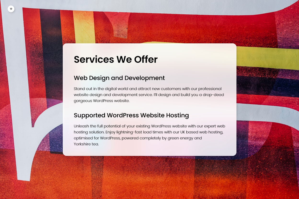
So with the orphan tidied up, here’s the difference between the first and final designs, to see how much difference all those changes have made:


And there you have it – six practical UI hacks to enhance your designs, just waiting for you to put them into action:
- Line width
- Vertical paragraph spacing
- Line height
- Consistent text alignment
- Hierarchy through weight and colour
- Letter spacing (especially headers)
These tips will not only improve your design skills but also help you understand the crucial role typography and layout play in effective design. Remember, it’s not about knowing the most trendy design tricks or having the fanciest toolkit. Good design lies in understanding the basic principles, like the ones we’ve covered in this post.
Every design decision, from the line height of your headings to the width of your text blocks, impacts how users perceive and interact with your designs. By utilising these tips, you’re able to create designs that aren’t just visually appealing, but also functional and user-friendly. After all, good design isn’t just about looking good—it’s about creating a positive user experience.
And remember, as designers, we’re always learning. We hope that sharing these tips will help you avoid some common pitfalls and speed up your own design learning journey. Keep experimenting, keep learning, and above all, keep designing!
I’d love to hear from you – do leave a comment below with your favourite tip from the post or any other UI hack you swear by. Sharing your insights not only adds value to other readers but also sparks a dialogue from which we can all learn. Looking forward to your thoughts!


0 Comments